Progressive Auto Quote — Coverage & Decision Experience Redesign
Redesigned Progressive’s auto-quote entry and built a responsive prototype from quote start through an illustrative coverage decision.
2026
Why I built this
After going through Progressive’s quote process myself, I felt there was a lot to keep track of at once. I wanted to see if clearer steps could make coverage and pricing easier to understand.
Tools I used
Next.js · React · TypeScript
What I did
- Simplified the beginning of the auto-quote process while keeping access to Progressive’s other products.
- Built a working prototype that shows information step by step instead of presenting everything at once.
- Created a coverage and pricing screen that lets people compare choices using clearly labeled sample prices.
What this shows
I can take a complicated decision and make it easier to follow without hiding important information.
Visual proof
Independent concept project based on Progressive’s publicly observable quote experience. Not affiliated with or commissioned by Progressive.
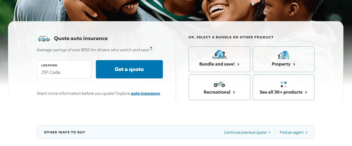
Progressive homepage captured for analysis — September 2026
Why this redesign: Progressive serves many insurance needs. I focused on creating a clearer entry path for visitors seeking an auto quote while preserving access to the company’s broader products.
- Quick Start (current step)
- Vehicle
- Driver
- Coverage
- Quote
Quick Start
Start with a few basics. This concept simplifies how information is introduced; a real quote may require more.
A real working prototype — move through the stages, try “Try an example,” switch packages, and change the deductible at the end. Responsive down to 360px.
What I learned
I learned that complicated products do not always need fewer choices. Sometimes they just need to show those choices at the right time.
What I will do next
I will test the prototype with real people, use where they hesitate or get confused to improve the experience, and then refine the quote flow.